
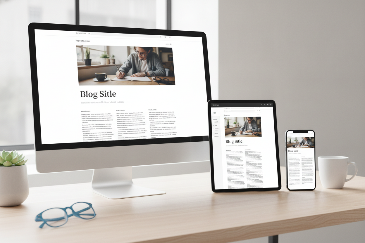
The best blog layout is one that helps the writing feel effortless to read. For Sedona’s Thought Spot, that means prioritizing a clean structure, clear navigation, and enough space for the content to breathe. A strong layout does not need to be flashy. It needs to be practical, responsive, and easy on the eyes.
One-column designs often work well for long-form posts because they keep the reader’s attention centered on the text. This is especially useful for creative writing or reflective articles, where the content itself should remain the focus. Sidebars can be helpful, but they should never crowd the page or compete with the post.
Responsive behavior is essential. A layout that works beautifully on desktop but becomes awkward on mobile will frustrate visitors quickly. Text should resize well, menus should collapse cleanly, and images or widgets should not break the reading flow. Good layout decisions make the site feel polished across devices.
Visual balance matters too. Margins, spacing, and line length all shape how comfortable the page feels. When these elements are handled well, the blog looks intentional and professional without feeling rigid. A simple layout is often the most effective choice because it keeps the reader grounded. For a writing-focused site, that clarity is a major advantage.
Leave a Reply